22-06-2008
5 Comments »
The Dunkman Logo – Original vs Flying Dunkman »
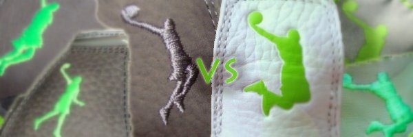
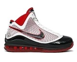
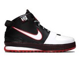
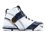
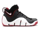
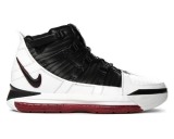
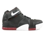
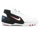
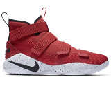
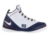
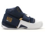
The evolution of the Dunkman is an interesting history. Some believe that the whole Dunkman concept was inspired by LeBron’s favorite superhero, which supposably was The Hulk, but the truth is it’s Batman. The mean green color was chosen for no deeper meaning. People liked the color version and the designers thought it would be cool to do it. The pose represents King James’ first dunk in his NBA Debut, which is his signature dunk now – a combination of elevation and power. One year ago we featured the Dunkman logo evolution, but a year has passed and several new shoes have been released. It’s obvious now that the limited so far White/Grey/Mean Green combo has become one of the mainstreams of the LeBron James signature shoes line. It’s not obvious why the logo has changed over the years. With the release of the Zoom LeBron IV the new logo was unveiled – a silhouette of LeBron’s Dunk from the ZLIV commercial. Maybe Nike was trying to establish a final version of the logo and if their goal is marketing the change is understandable with this new better-ballanced Flying Dunkman. Nevertheless of the origin we want ask you, the fans, which one is better so go ahead and cast your vote in our latest poll.